| Red Flags and "Rip Your Face Off" Bounces Stocks are relatively sleepy due to low summer volume. The primary dynamic since the summer started is that rallies are lethargic and occur after days of chop (see red rectangles in the chart below). 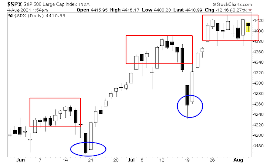
The problem is that whenever stocks start to roll over, "someone" steps in and manipulates them higher. We get at most a day or two of selling, followed by a "rip your face off" bounce. I've marked this in the above charts with blue ovals. In this environment, large institutions are not buying, but they're also afraid to sell for fear the Fed (or whoever is manipulating stocks higher) will instigate a major bounce. In this environment you get a slow grind higher. Underneath the surface, things are looking weak. High-yield credit, which usually leads stocks, is rolling over. 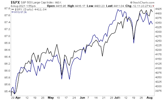
Similarly, breadth, which also usually leads stocks, is breaking down. 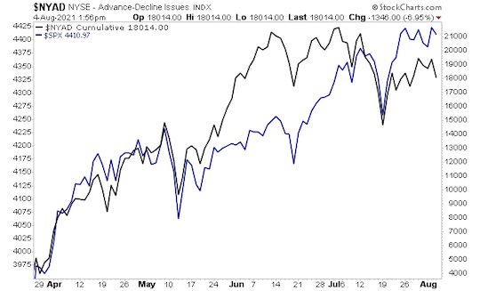
The ratio between stocks and long-term Treasuries has a rounded top. 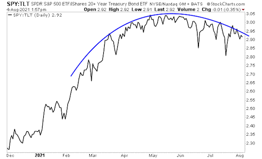
The long-term chart for this ratio shows that it has broken out of its long-term upwards channel. This suggests a "reversion to the mean" move is coming, which will see TLT dramatically outperform SPY. 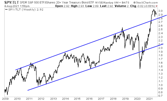
We see a similar over-extension in the ratio between stocks and the $USD. This, too, suggests a "reversion to the mean." 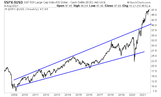
Both of those charts tell us that stocks are severely overbought. Does this mean a collapse is just around the corner? Not necessarily, but it DOES suggest that the primary focus for investors in this environment should be risk management, NOT loading up on stocks. What could trigger a serious risk-off move? It's difficult to tell. Certainly if the U.S. started another round of lockdowns or even partial lockdowns, things could get messy. There's also pronounced economic weakness showing up in the hard data. Take a look at the below chart from Societe Generale and you'll see what I mean. The economy is surprising to the DOWNSIDE in a big way, 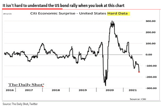
I'm watching this situation closely and will issue updates as needed. But red flags are starting to crop up in the markets. Best Regards, Graham Summers
| 
No comments:
Post a Comment